Why the New Facebook Profile Doesn’t Work
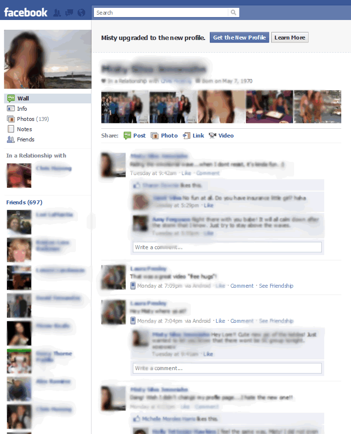
The new and not improved facebook profile page
Continuing our discussions about companies that seem to be run by monkeys is… Facebook. It’s not that I doubt Mark Zuckerberg’s genius or that Facebook revolutionized the way we connect with friends and family, but some of their user experience decisions really make me wonder. If I had to describe them in one word, it would be “juvenile.”
Why juvenile?
Because the people in charge of the changes seem to have no basic understanding of what Facebook members need or want, nor of basic design principles. It’s as though they’re following a whim rather than tracking user actions.
I’ve already written about the 14 biggest usability mistakes on Facebook. Nothing has improved since then. But a few days ago, Facebook rolled out a new profile page. In my opinion, it’s another huge step back in the user experience.
Let’s go over the new page from top to bottom and dissect it to find out why it doesn’t work.
Putting Common Knowledge at the Top
At the top of the page, we have the name — that’s good! — followed by a few details about who this person is in a relationship with, their birth date and education. This part of the page is the most valuable “real estate,” the area that everyone sees every time they look at the profile.
It’s now showing content that rarely changes and that friends and family already know — and it’s showing it ALL THE TIME. Every time I go to this person’s profile, I’m going to see the same information about them. Dear Facebook, this is my FRIEND. I already know who they are sleeping with, and their date of birth.

Dear Facebook, this is my FRIEND. I already know who they are sleeping with, and their date of birth.
On a public social network like LinkedIn, where I view a lot of profiles of people I know nothing about, it is helpful to include basic information at the top of the page (well, except for the relationship bit). It helps me to absorb quickly the basic information I need to determine whether I should do business with them.
But Facebook is a closed membership site. We use it to view profiles of friends and family, people with whom we’re already familiar. Showing basic information that doesn’t change at the top of the page makes no sense at all.
On the old profile, basic information like this was on the left side of the page, which made a lot of sense. It wasn’t in your face each time you visited the profile but it was there if you were looking for it.
Displaying Distracting Pictures at the Top
Under the relationship, education and birthday information, we bump into a bunch of what appears to be random pictures of this person taken from their albums. Again, it really begs the question: WHY? Photos grab attention and distract us from what we really came to do. That’s not to look at an old picture that we’ve already seen, but to see what’s new with our friend, what they’ve been up to lately, what’s on their mind. None of those things is likely to be a ski trip from 1997.
This collection of photos is so distracting and so in your face. It’s like someone jumping in front of you as you try to greet a friend.

Photos grab attention and distract us from what we really came to do
Sharing is Harder
Moving down, we see “Share: post, photo, link, video.” The box that allowed us to enter a comment just by clicking on a box and hitting Send is GONE. Now I have to find the share area and realize that I have to click on “post” before I can write anything. These are just way too many unintuitive steps for doing something that’s very basic.
The old comment box was one of the things that made Facebook such a success. Its simplicity had a huge psychological effect, encouraging people to send quick notes and stay in touch. Having a photo right next to that box was also important. All this is gone now, leaving us with tiny links under random photos that overshadow them completely. Now the feeling is that we need a reason to write.
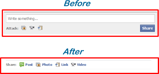
The old comment box was one of the things that made Facebook such a success All this is gone now, leaving us with tiny links under random photos that overshadow them completely.
No Important Info on Top
Moving further down the page, we notice that we’re missing some useful tabs: walls, photos, info, links. Those tabs were taking us to the information we really needed when visiting someone’s profile — the stuff that changes regularly — and they were right on top, where they should be. But now they are on the left, under the photo, a less important region. The main spot is taken by those old vacation snaps.
It’s pretty basic stuff: put the important information top-center. Put the less important stuff on the left or bottom. Put the call to action at the top-right. It’s the ABC of user experience.
On the left, I can see who my friend is in a relationship with, and this time I can also see a picture of their partner; before it was just a link. That’s an improvement but do I really need to have this at top-center as well?
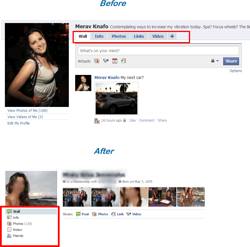
It's pretty basic stuff: put the important information top-center. Put the less important stuff on the left or bottom. Put the call to action at the top-right. It’s the ABC of user experience.
List of Friends Take More Space Than Necessary
Below the partner, I can see a list of friends, as before, but now instead of seeing six thumbnails that took a small amount of space, I get a list of TEN friends with names and picture, one after the other, that take a huge amount of space. Again, WHY? On average, people have about 150 friends. Since there is no way to show all those friends on the profile page, displaying just a small sample makes sense. Why show a much bigger sample in a format that takes a lot more space?
I do like the separate family list though. That’s useful. But the list of friends and family together is so long that you barely notice the links under them.
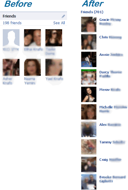
Why show a much bigger sample in a format that takes a lot more space?
Call to Actions Are Hard to See
On the right, moving the “chat,” “send message” and “poke” actions to the top right makes sense as far as usability is concerned but the photos to the left and under them make the actions hard to see.The 30 pixel gap below helps a bit though.
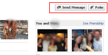
The photos to the left and under them make the actions hard to see
The Facebook profile page is the site’s most fundamental feature. Since people spend more time on Facebook than any other site on the Web, it’s important to get it right and not annoy them with visual noise and misplaced priorities. Making sure that the most important elements are top-center, that there are no distractions in the form of photos, that it doesn’t take too many steps to perform the most common actions, and that basic information doesn’t take prominence are all key to doing it right. In fact, the way it was before. Why fix something that’s not broken?
In other words, fire the current designer and hire back the previous one… with a bonus!

The Good Badger
| #
Great post Merav.
I agree with you on 90% of what you said. The essential information at the top of the page should already be known by the person visiting said page. If you’re visiting a friend’s page to see what’s new in their life, Facebook is dedicating an awfully prime spot to something that remains relatively static.
I also agree wholeheartedly about “sharing box”. I bet you anything they will go back to the old design as older users (the 45+ range) will start to post less frequently as a result of confusion.
The placement of the “send message” just baffles me. That’s probably the worst move of them all.
The one new feature that I do like, and apparently we disagree on this, is the prominence of a user’s pictures. People are inherently lazy, and would always prefer a picture to words, and a video over pictures. A picture can often tell a story would require a vast number of words to replace (I think the rough conversion is 1:1000).
What’s interesting, is that Zuckerberg himself didn’t really believe in the value of pictures, but as Facebook has grown, the feedback for pictures has greatly exceeded his expectations. I’m pretty sure this change was made as a direct result of the way people are currently using Facebook, and was aimed to improve their UI.
All in all, great post and I thank you for writing it.
Reply
Merav
| #
Thanks Zach! of course pictures are important and tell a story, but do they have to be in the most important real-estate of the profile? Ask yourself, when you go to a friend’s profile, do you go to see random photos or to see their latest status update (what’s new in their lives), if the second is the true, then that should be the most prominent thing on the page, and not random photos 🙂
Reply
JonG
| #
I agree with you all. I’m not upgrading to new profile. though they forced the retarded comment box on me. well they pretty much took it away. why make something easy difficult? you know? I hope they go back to the old and only fix stuff that needs fixing, like the info page layout and easier usability/visability/etc. What may be better, is a page that personalizes itself automatically based on how you use. or options to fully customize the page layout and turn on and off functions, etc. move info. to the places the user wants it. now that be cool.
Reply
Guillermo
| #
Hi Merav!
I just agree a lot with you, the pictures at top are distracting, the Top info, I mean, the tabs now are at the left column,under the picture profile, but is not good when you have a big picture as profile image showing your logo or another info, not everybody uses this place to show a picture 😉
Best regards
Reply
Draith
| #
I wholeheartedly agree with this assessment of the new profile… And of facebook’s movements in general. I find almost every new change that comes up to be a step backwards as far as usability is concerned. Facebook never listens (and has never listened) to user complaints or suggestions, no matter how many million members join protest groups to make their voices heard.
One aspect I feel this post left out, however, is the fact that the latest status update–something visitors to friends’ pages undoubtedly look for when they click to view a friend’s page–is completely missing from the top of the profile, inevitably buried under whatever OTHER “updates” and actions are taking up room on the wall below.
The latest status being at the top of the page was incredibly useful, and removing it, to me, seems to also remove a bit of the usefulness of HAVING a “latest status update” in general. Even Twitter shows your latest tweet… Why is Facebook so constantly making itself harder to use?
Reply
pizzo
| #
Is Facebook having a financial trouble? The new profile update looks like they’ve employed a bunch of monkeys to replace their human engineers to cut on budget.
Reply
Sof
| #
Hey, do you know the “info box”, the one that USED to appear below everyone’s profile picture,.. well, I think the new facebook took it away. Is it going to be temporary or is it never ever going to appear again? I don’t really like the new facebook, finally when i got to like the new one, they changed it again. Why do they have to make things so complicated? It was just fine the way it used to be.
Thanks, hope you can give me an answer 🙂
Reply
SkeletalPirate
| #
I’m looking for this info box too on the new layout pages. I think they trashed it!!!!!
WHY?
That was awesome…I had a bunch of VERY important crap there!!!
Reply
Rahmster
| #
I totally agree with everyone’s comments. Unfortunately, I “upgraded” to the new page and now I can’t tag people in my posts. I type in the @ symbol, and nothing happens. Anyone else having this problem?
Reply
Merav Knafo
| #
Not sure, because I don’t plan to upgrade, ever! 🙂
Reply
Merav Knafo
| #
Everybody seems to hate the new profile, take a look here:
http://blog.facebook.com/blog.php?post=479551972130
Anyone at facebook listening?
Reply
Srini Kumar
| #
I have been railing on this in Techcrunch… your blog post hits the spot !
Photos are taken for a few reasons:
* Memory – where was I?
* Belonging – you were there too, weren’t you?
* Aesthetics – that’s beautiful!
* Capture a Moment – occasionally you see a double rainbow
* Narcissism – here’s me everybody ! me ! me ! me !
I think the new profile emphasis on photos adds a few weird ones:
* Now Your Friends Taking Photos Of You Are Facebook Surveillance Agents
* You Are What You Look Like, Not What You Think
Other people tagging me in photos feels like I suddenly live in the former East Germany and everyone’s reporting on everyone else.
Reply
Prisqua
| #
I suppose I am using Facebook through my iPhone it really does not bother me how a Facebook profile looks. People will always complain about changes anyway until they get used to it.
Reply
Ryan
| #
You are right of course, wey well done post, but um… why focus so much on something you don’t like? 🙂
Reply
Merav Knafo
| #
By default, when talking about usability problems, one must focus on what’s unwanted; if they usability was perfect, I would have nothing to write :-). The hope is to educate and entertain.
Reply
How to Remove the Photos on Top of Your Facebook Profile | iJoomla Blog
| #
[…] few weeks ago, I explained why the new Facebook profile doesn’t work. One of the main issues was the photos that show at the top of the profile seem totally random and […]
Reply
Daniela
| #
Why my status doesn’t appear by my name on my Facebook profile???
Reply
The Top 14 Annoying Facebook Behaviors That Will Cost You Friends | iJoomla Blog
| #
[…] written before about Facebook’s usability issues, especially regarding the new Facebook profile. But Facebook doesn’t seem to care about the user experience and the chances they’ll make any […]
Reply
William LaSalle
| #
You are right. It was working, now it is clunky and slow and over burdened.
If it is broke don’t fix it.
KISS, Keep it Simple Stupid.
The new facebook is glitizer.
I hate the new photo viewer.
Someone posted a bunch of stuff about Better Facebook on my page and wants me to send them five dollars to add on some apps to make facebook work almost as good as it did before the improvements were added.
Great.
I shouldn’t need to do this. The Damn Thing Should Just Work As Good As It Did Before The Improvements Were Added.
Also if I like anything or invite a friend or accept a friend ship request I get Temp. banned.
Also the Facebook Spam Detector thinks any song post is Spam. Each improvement to Facebook has made it worse.
Sometimes my facebook profile loads and it won’t let me post or like anything.
Reply
William LaSalle
| #
Thank you so much for posting this, maybe Facebook will listen.
Reply
William LaSalle
| #
Today was one of those days when Facebook was working, then decided to kick me off.
Reply